August 06, 2013
I recently had a brief1 online exchange with Matt Copeland, a former coworker at ThoughtWorks, about the website shouldiuseacarousel.com. It's a fun little site presenting several bullet points against the use of carousels (rotating banners) in website UIs2.
I'm no designer or UX expert. Over the years I've noticed that I do seem to take a greater interest in frontend-y stuff than most other developers I work with; but that's a far cry from someone with expertise in user experience. Still, when Matt first posted a link to the carousel-bashing site I found myself responding skeptically. Of course, maybe that's because I respond skeptically to pretty much everything that exists in this world.
Anyway, this shall be my attempt to explain my skepticism, concisely if I can (but knowing me, I probably can't).
Judgments require context
Consider this point:

Where is it? To answer that question we need some frame of context, or reference. For example, we could define a plane that the point lies in, with X and Y axes. Let's do that:
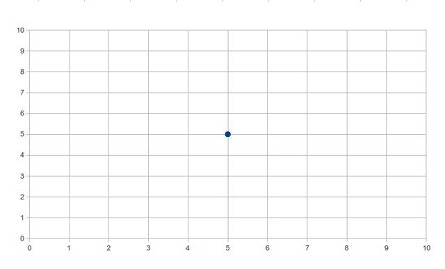
Now we have context. The point is at (5, 5).
Contexts can be changed
But wait, is the point really at (5, 5)? Or is it just somewhere, and we overlaid a pair of axes on top of it? Clearly—in this case at least, since I'm the one writing this!--it's the latter. We could just as easily draw the context like this:
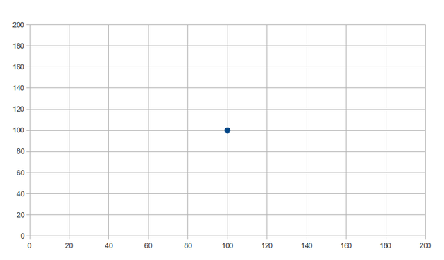
Now the point is "at" (100, 100).
The lesson here is that the context we bring to something affects how we measure it. This example was abstract, but the principle applies to all kinds of things.
Of course, we all know that already, right? Sure—but it's easy to forget it, or to fail to recognize where it applies, especially when the "point" is something we feel strongly about.
Back to carousels
Whether carousels are generally "good" or "bad" isn't a question I have any ambition to answer. If anything, if the UX community seems to have reached a consensus that they're not good, I would tend to yield to that opinion. What I want to point out is simply that this is a case of bring-your-own-context, and that in such cases it's necessary to acknowledge that fact before zeroing in on a judgment.
To be more specific: of the 6 references to information arguing against carousels on shouldiuseacarousel.com, 4 of them are explicitly about "clicking" or some other form of user interaction (such as a user performing a "task"3). I checked and one of the remaining 2 (this article on the site WiderFunnel) similarly appeals to carousels' poor click-through performance. (The other reference I couldn't track down in about 20 seconds of Google searching, so I didn't bother. That's at least 5 out of 6.)
The overall picture I get from this is that carousels are bad at generating clicks. This is the context, the frame of reference, that I guess a lot of designers must use in evaluating the effectiveness of some UI element. And maybe that's fair, especially considering how much screen real estate carousels generally take up. (If it isn't driving clicks, did we really have to make it so big?) But surely it isn't the only possible metric by which we could make a judgment.
Personally, I found the anti-carousel argument presented on the site a little odd at first. I'm not deeply involved in the world of UX, so maybe it's because I haven't internalized the same metrics by which most professionals in that world tend to judge interfaces. But I never thought of carousels as being a vehicle for interactive elements in the first place. I thought of them more as little slide shows, presenting content in a space-efficient way without requiring the user to scroll.
Here's an example: the home page for Regal Cinemas has a carousel showcasing some of the films that are currently playing in their theaters. This may be good or bad for a host of other reasons; again, I'm no expert. But I do think it would be wrong to assume that this particular carousel exists to generate clicks.

See, I actually think that this one makes sense. Yes, there are little interactive elements—links to buy tickets and view the trailer for each film—but they hardly seem like the focus here (as is evidenced by their tiny size and way-off-to-the-bottom-left positioning). I would guess that the implicit purpose of this carousel is simply to give the visitor a quick survey of what's playing right now. To me, it serves that purpose well.
So this is a clear example of how the context you bring to something affects your judgment of that thing. We could judge carousels based on their click generation effectiveness, in which case they look pretty bad:

But we could also judge them based on, say, information density (how much content is presented in a given area of the screen), in which case they would fare much better:
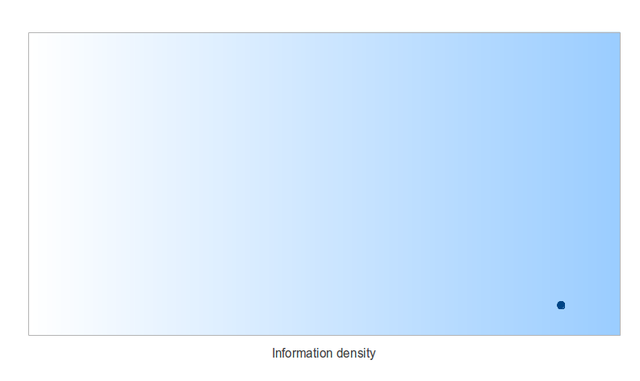
Keep in mind that I'm not saying information density is necessarily a worthwhile metric. Simply that it's a separate one from click generation—I think that much is obvious—and so answering the question of how carousels measure up on that front requires a different set of questions.
A fixed context is basically dogma
As I already said, I'm not here to argue that carousels are awesome. My example of information density is in fact probably a poor one, since I'm guessing most UX professionals would say that too much densely packed information is a bad thing. But if you at least agree that there are multiple ways to judge the elements of a user interface, then it should give you pause when someone says "Don't ever use widgets because they're bad at X."
X may be important. But it likely isn't the only characteristic by which a widget should be judged. This attitude is analogous to taking the coordinate system from my first example, where the point lies at (5, 5), and treating it as fixed, unaware that someone else could use a different system and interpret the point as somewhere else. A person with this mindset might think of the coordinates (5, 5) as being an intrinsic property of the point, and therefore view the point as inherently either "good" or "bad" based on that. To me, that's pretty much the same thing as dogma: refusing to acknowledge the possibility of other contexts.
I realize that I'm getting a bit heavy-handed at this point, so I'm going to call it a day. I leave you with these words of wisdom:
"Don't ever use hammers. They're really bad at driving screws."
-
As in, literally about 2 Tweets each. ↩
-
Ironically, the site itself uses a carousel (to drive home the point, I guess). ↩
-
And to my dismay, the "task" article about a user failing to recognize a deal displayed on a carousel, appears to be based on a single user. What? Are we really going to treat that as rigorous research? ↩